August 25, 2014;Vox and The Mendoza Line
Are you ready for another article about the ice bucket challenge? Almost everyone in the nonprofit world and beyond is aware of the phenomenon. It has been analyzed from many angles: why it works, when it works, what nonprofits can learn, etc. Now, it appears the world of health and science is analyzing its other angles—as are statisticians.
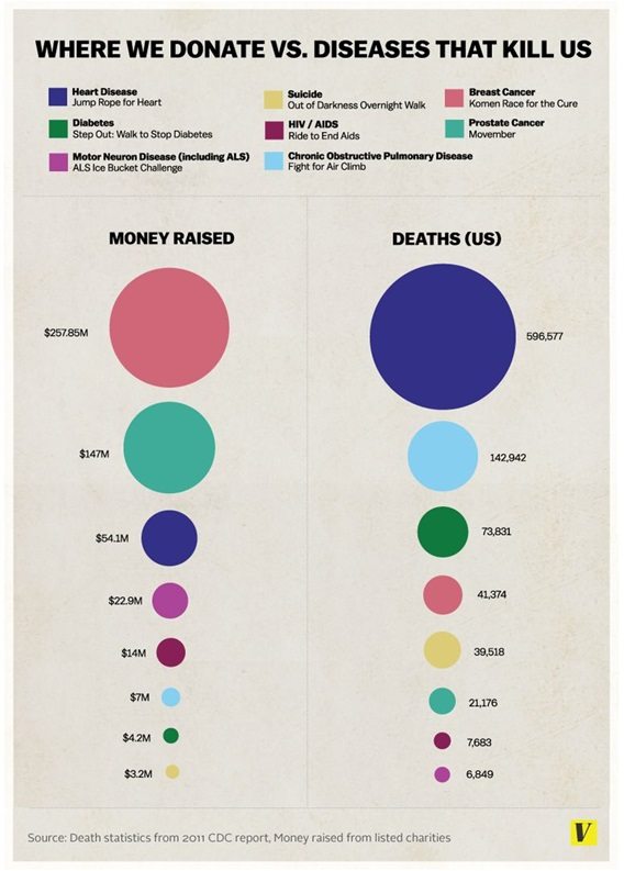
Using statistics from the Center for Disease Control, Julia Belluz’s article in Vox features an infographic comparing “Where we Donate vs. Diseases that Kill Us.” The very colorful bubble chart shows that the diseases that impact the most people and those that net the most money and attention are not the same. For example, heart disease kills far more people than does breast cancer or prostate cancer, yet the Jump Rope for Heart receives far less than the Komen Race for the Cure or Movember do.
The article proposes, as summarized by self-described “data journalist” David Mendoza, that “people inefficiently donate money to charity. Rather than directing donations towards fighting the diseases that ravage the most people, we give money for less pragmatic reasons.”

Sign up for our free newsletters
Subscribe to NPQ's newsletters to have our top stories delivered directly to your inbox.
By signing up, you agree to our privacy policy and terms of use, and to receive messages from NPQ and our partners.
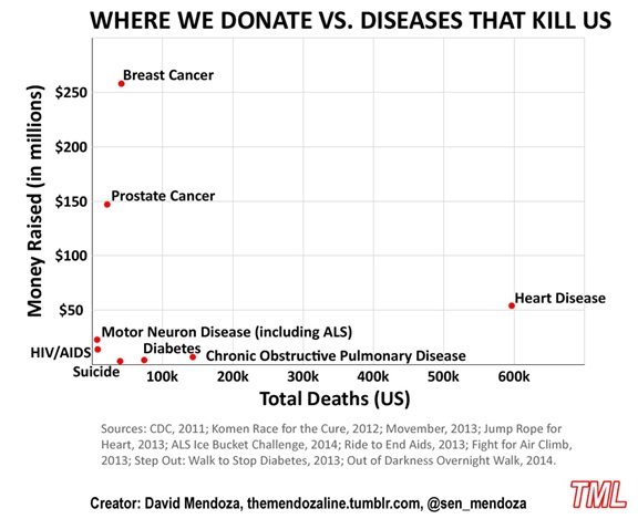
In his blog post, Mendoza, more concerned with the accuracy of how data is displayed, argues that a scatter diagram is a better way to depict the data than the above-cited bubble chart. His diagram compares money raised with total deaths for several illnesses.
The science blogs, the health blogs, the data visualization blogs, and the philanthropy blogs are all talking about the same topic. It’s been quite interesting reading all the analysis of this viral fundraiser.—Jeanne Allen