January 29, 2013; Social Media Birdbrain
Sign up for our free newsletters
Subscribe to NPQ's newsletters to have our top stories delivered directly to your inbox.
By signing up, you agree to our privacy policy and terms of use, and to receive messages from NPQ and our partners.
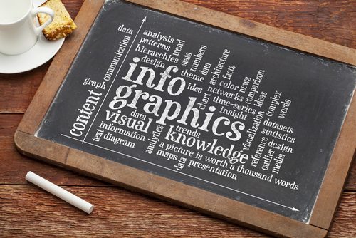
Nonprofits are constantly looking for more effective ways to raise awareness about causes, and infographics are valuable online tools for consolidating data and spreading the word. But what really makes an infographic successful?
Social Media Birdbrain has highlighted six infographics created by charities that relay information in a helpful and eye-catching manner. Many of these infographics are several years old and out of date, but the post shows the potential that creative infographic designs have in spreading an organization’s message much farther. Several of their examples were:
- Movember – Movember is a yearly charity initiative in November that raises money for prostate cancer while celebrating how long and fancifully men can grow their moustaches. The organization has created a handful of very well designed infographics that inform participants about prostate cancer and men’s health while highlighting the campaign’s social media success and throwing in some fun facts about the history of the moustache, too. Although there is a lot of information conveyed here, that information is well organized and isn’t overwhelming.
- Amnesty International – For their fiftieth anniversary, Amnesty International designed five infographics illustrating the organization’s progress in maternal health, human rights, abolition, and activism through letter writing. Each graphic was designed by Jennifer Bradshaw and depicts the progress the organization has ignited for causes, while also highlighting shocking statistics on the work that still needs to be done—for an example, see the maternal healthcare crisis data.
- C.A.L.M. – A British charity, the Campaign Against Living Miserably, put together a short and concise graphic highlighting the enormity of suicide across the globe as well as suicide’s predominant impact on males. The infographic is very simple, using only two contrasting colors and large numbers to relay the information.
- Water Aid – Water Aid put together a very creative and eye-catching graphic to illuminate the global water accessibility problem. The infographic was created for a 2012 World Leaders meeting to bring light to how crucial water sanitation issues are internationally. Water Aid uses a visual pipeline to guide its user throughout the graphic with a flow emulating water, starting with shocking statistics on sanitation and water safety, particularly in Africa, and then ending the pipeline by articulating how small donations can make a big impact: “Access to safe water and sanitation could save up to 4,000 children’s lives every day.”
There seems to be an infographic for everything these days, but these are noteworthy examples of how charities can engage their online audience through infographics. Another important step in creating infographics is making sure you are utilizing social media, specifically networks that thrive on images and graphics, such as Pinterest. NPQ would be interested to hear what the sector believes makes an infographic successful.—Aine Creedon