September 5, 2013; Forbes
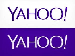
If we had a dollar for every time we have seen a nonprofit spend way too much time on its logo, we would be rich. But take heart. Apparently, the new, much labored-over logo for Yahoo! is not a big hit, proving that money doesn’t solve everything.

Sign up for our free newsletters
Subscribe to NPQ's newsletters to have our top stories delivered directly to your inbox.
By signing up, you agree to our privacy policy and terms of use, and to receive messages from NPQ and our partners.
It wouldn’t be very noteworthy, I suppose, if it were not clear how much time, effort, and expense were expended in the odd effort.
Yahoo! spent a month of “forced fun,” floating dozens of potential logos, but in the end rolled out one that was apparently custom-designed by the CEO, Marissa Meyer, and a team of designers. In describing the design concept, after going on and on about the font and mathematical consistency of it all, Meyer commented, “Our last move was to tilt the exclamation point by nine degrees, just to add a bit of whimsy.”
Yahoo Chief Marketing Officer Kathy Savitt made certain, however, that we did not take that “whimsy” to mean flimsy, “You’ll notice a chisel to our logo that’s very architectural,” she said. “What we’re saying is our logo is the foundation upon which our brand and products and user experience will continue to be built.”
We liked some of the critical thoughts about this masterpiece. Deep Focus ad agency CEO Ian Schafer said, “I believe the font is ‘Meh Condensed.’” And perhaps not altogether seriously, Skift CEO Rafat Ali commented, “I feel cheated and violated. Yahoo, you made a mockery out of all of us.”
We’d love to hear from all you marketing whizzes out there about how a logo change should be approached and of course we’d love to hear any stories you have about your own logo hells.—Ruth McCambridge


