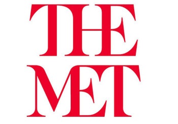
February 18, 2016; New York Times
I feel embarrassed that I cannot work up a rage against the Metropolitan Museum of Art’s new logo. It has been called ATROCIOUS (in capitals—really creative, that); “indisputably wretched”; a “graphic misfire”; a “typographic bus crash” and so on. And I can’t get even a little bit stirred up about the whole thing.
In fact, I am kind of glad they finally did away with the forty-year-old faux-Leonardo da Vinci-type thing, replacing it with what a lot of people look at as a bastardization of a font in red. The old logo was actually derived from a woodcut by Fra Luca Pacioli, who taught math to da Vinci. The new logo was designed by the firm Wolff Olins and comes complete with an explanation in which I am completely uninterested. Long story short, the museum did not want to be stuck in the 13th century; now it has decisively advanced to a mere half-century ago. One comment on an article described it as having a “pretty skeezy ’70s vibe.”
Sign up for our free newsletters
Subscribe to NPQ's newsletters to have our top stories delivered directly to your inbox.
By signing up, you agree to our privacy policy and terms of use, and to receive messages from NPQ and our partners.
I would disagree with the “skeezy.” But some just do not appreciate that late mid-century abandon. Justin Davidson, the architecture critic at New York magazine, wrote, “The whole ensemble looks like a red double-decker bus that has stopped short, shoving the passengers into each other’s backs. Worse, the entire top half of the new logo consists of the word ‘the.’”
Jeez, maybe that’s the point—a smash-up of the many centuries of art on exhibit at the Met!
The only thing the Met might have been sure of when they unveiled this new symbol was that there would be much negativity expressed among the art critics of New York—and they are thick on the ground there. As Danny Lewis writing for Smithsonian observes, “Critics may grumble about it now, but it’s impossible to know how it will be received once it has been around for a few years. By then, chances are it will be absorbed into the background, a nearly invisible symbol people don’t even think twice about—the sign that a design has done its job.”
I might suggest that such horror and angst being expressed loudly and publicly can only work to the museum’s favor. Art, after all, is meant to disturb our current collective consciousness over time, and at least people have noticed.—Ruth McCambridge


