
Editors’ note: This article was adapted from a webinar presented by the Nonprofit Quarterly on February 17, 2016. The webinar was led by Hilda Polanco, founder and CEO of FMA, the go-to capacity builder to which foundation and nonprofit leaders turn to address nonprofit financial-management issues. Polanco was a founding member of the selection committee of the New York Nonprofit Excellence Awards, established by the New York Times and the Nonprofit Coordinating Committee. When not speaking publicly or leading FMA’s team, she provides direct capacity-building, training, and coaching services to foundations and nonprofits across the country. This article is from the Nonprofit Quarterly’s spring 2016 edition. It was first published online on May 9, 2016.
Nonprofits are complex enterprises. They are built around mission and desired outcomes but must be supported by the right revenue and expense models—which together comprise an integrated enterprise model. As an organization’s goals, strategy, and operating context shift over time, a dashboard allows a nonprofit to monitor both the effectiveness of this enterprise or business model, as evidenced by the organization’s financial health, and the impact of the programs and services being provided.
Ideally, dashboards are presented quite simply and graphically, so that decision makers can see at a glance whether and where the organization is on the path it has laid out for itself. Dashboards focus the conversation at the board and staff levels, clarifying the goals and strategy of the organization for both groups. Additionally, dashboards can be used with funders and other stakeholders to transparently show progress toward the desired goals.
This article focuses more on the financial component of a dashboard than the programmatic one, and it uses examples from organizations that deliver a relatively more “countable” service than those doing less tangible advocacy work. But the examples demonstrate many of the critical principles involved in dashboard creation, and are a good start to understanding the components of a great dashboard. The aim of this article is to set readers on the path toward creating an effective dashboard or improving one already in use.
The Process of Developing a Dashboard
The hard work in developing a dashboard starts with setting a strategy, establishing goals, and defining the associated metrics. This process should involve the board and key staff from across the organization in rigorous, team-based discussions. These discussions should be ongoing, because no dashboard is final. While some baseline metrics, especially financial measures, might be a semipermanent fixture on a dashboard, parts of any dashboard may be experimental. They should illustrate a hypothesis in a form such as, “If we do more of this, then we expect this outcome as a result.” Due to environmental, technological, or market changes, however, formulas that work one way today may function differently tomorrow, and it is important to continue to question, evaluate, and reset not only goals and strategy but also the metrics being used to measure success.
A dashboard must do the following:
- Align definitions of success across the organization;
- Encourage dialogue about progress toward goals;
- Facilitate timely identification of successes and challenges;
- Ground decisions in concrete data and evidence; and
- Illuminate relationships between different activities.
Successful dashboards also do the following:
- Effectively communicate strategic-level results;
- Present data in a user-friendly visual format;
- Create a snapshot of current status as well as trends over time;
- Clearly show performance against defined targets;
- Highlight out-of-the-ordinary results; and
- Include a manageable set of key performance indicators (KPIs).
Selecting the Dashboard Elements
Deciding what data you will track and understanding how that data will influence decision-making are two of the most critical points in the process. There is no one-size-fits-all approach to creating a dashboard, though much can be learned by looking at other dashboards in (and also outside) your field of practice. One key question to clarify as you begin the dashboard design process is whether the dashboard will track metrics at an enterprise level or just for a particular program or function. Another question is that of audience: Will this be a reporting tool for your board, staff members, or funders—or some combination of the above?
As you begin to define what to measure, one of the issues to consider is interrelationships between data points. If you thought, for instance, that controlling staff turnover would improve the way patients experience service at your health clinic while at the same time lowering human resources costs, how would you test this idea? Your goals may be to control costs and provide better service and patient outcomes in some kind of measurable way, but first it is important to test your hypotheses about how one thing affects another. Dashboards can help you to connect the dots through carefully selected metrics. Then again, you may decide on a more independent goal, like developing a particular level of reserves or achieving a proportion of revenue that is unrestricted. These goals are related to financial stability and liquidity, and while there certainly may be some correlation between these goals and overall organizational performance, goals of this nature are less of an “if this, then that” proposition.
What Should We Measure?
The metrics measured on a dashboard are commonly referred to as key performance indicators, or KPIs, and should be chosen in a deliberate, thoughtful, and team-based process. KPIs should be identified by means of an understanding of your organization’s business-model drivers—on both the expense and the revenue side. Consider each revenue stream and the factors that influence the reliability and predictability of that stream; examine key expense categories and what contributes to the rising or falling of those costs; finally, define the program delivery mechanisms that are influencing results—enrollment levels, quality of patient care, member retention—whatever it is that drives engagement in your program delivery.
With this information in hand, select the KPIs that focus the organization on data that will support decision-making. Consider whether you need a dashboard that reflects trends over time or performance against goals—or both.
Successful KPIs do the following:
- Represent business model drivers;
- Reflect progress toward intended outcomes;
- Guide priorities and decisions (“what gets measured gets done”);
- Are limited to a number that can realistically be monitored (the key in KPIs is important); and
- Are periodically reassessed (a set of KPIs isn’t forever).
Business Model Drivers
Different types of nonprofits have different enterprise models with different drivers for success. In many cases, we can learn a great deal from examining the dynamics of organizations that have drivers similar to our own—sector notwithstanding—but there are times when we will need also to look at the specifics. As we proceed, we will look at specific business models to clarify how to identify the drivers in each model and design KPIs relative to those drivers on a dashboard.
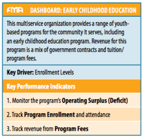
Early Childhood Education: Key Driver – Enrollment
We will begin with an organization that provides early childhood education. Whenever you have a fee-for-service delivery model, as in this example, it is important to monitor enrollment levels and the profitability of the programs given those enrollment levels. So, in this case we’re going to look at three particular things—we’re going to track enrollment; we’re going to track the resulting revenue from our enrolled program participants; and we’re going to monitor the overall surplus/deficit of the program. The questions we want to focus on as we analyze the results may include: Are we charging the right amount in fees? Are we collecting on those fees? Are we underenrolled? Are our costs low enough for us to generate a profit?
Below is a picture of what a dashboard for an early childhood education program might look like. A key thing to note is that, with respect to the year-to-date operating results, we want to look at actuals against budget as well as against past performance. When we compare this year’s actuals to these two other data points, we can see right away how the organization is doing against its current plan, and how it is doing compared to last year’s performance.
Another key area to highlight is demonstrated in the picture’s bottom two charts. These charts address this idea of enrollment, separating out the data between full-time participants and part-time participants. The charts not only give us the enrollment for the past year (what the organization is hoping to accomplish) and where it is as of this point in time, but also make reference to maximum capacity. When it comes to enrollment as a key revenue driver, the question of whether the organization is achieving maximum capacity is an important one. At FMA, we often speak to program directors who feel challenged by the fact that they are asked or expected to budget at full capacity, when in fact, historically, they’ve never reached full enrollment. So, how realistic is that budget? In contrast, the early education dashboard allows us to see where the organization is really pushing: on the half day, for the four-year-olds, it’s budgeting at maximum capacity. It hasn’t reached that level in the past, and it’s not quite on track to reach it now, but that’s where the push is. We can see in other classes that there’s an acknowledgment that the organization hasn’t reached maximum capacity in the past and is not expecting to reach it this year, either.
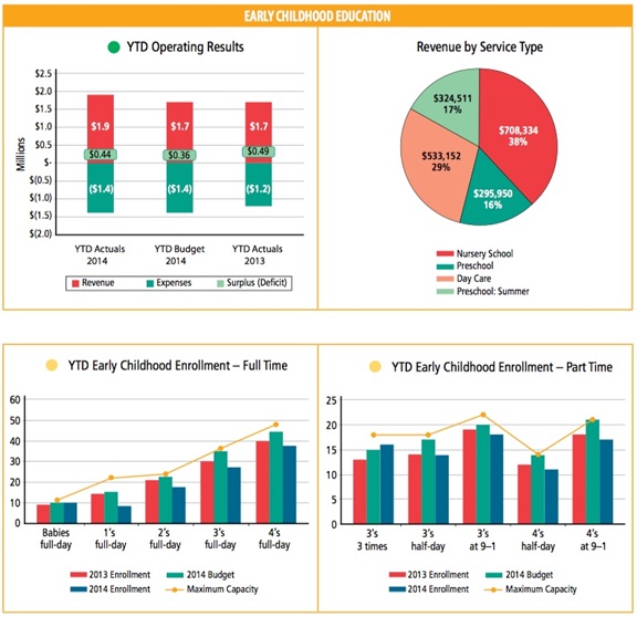
These measures give a sense of how this organization is planning relative to the past, and they emphasize the primary importance of program enrollment as a business driver; the organization will never realize its revenue goals if it doesn’t have the individual children in the individual seats at the right pricing. The conversation around this dashboard, therefore, brings program managers into a very deep engagement around the financial outcome of enrollment, and it helps program staff understand the consequences of not reaching the stated goal.
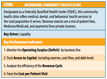
Community Health Clinic: Key Driver – Liquidity
Community health organizations are another type of direct service provider, and, in the healthcare world, operational efficiency is a very important driver. In this vein, the key things that community health clinics may want to look at include the optimization of the revenue cycle as well as the cost per patient served. In this type of organization, there is also often a heavy facilities component. So, if you run a clinic—or any type of organization that requires funds to maintain buildings and capital equipment—you want to keep your eye on whether you have the reserves you need, the cash flow, and the ability to carry the level of debt that may be required in order to maintain the necessary facilities and equipment.
The business model of a clinic ultimately depends on the organization’s ability to deliver high-quality patient care; but, on the financial side, the key is getting the cash to come in the door as quickly as possible to fund the operations. As soon as the mechanism for billing starts to slow down, liquidity comes to a halt. It’s a different model than that of a foundation-funded organization, where there is a $100,000 grant that comes in at the beginning of the year and the organization is set. In this world, revenue optimization has to be continuously refined, with attention paid to the engine that drives the cash while at the same time ensuring a focus on patient quality of care. You can see how significantly the priorities of this model differ from the enrollment statistics from the previous dashboard example.
Anyone who has attended an FMA workshop or webinar has heard us talk about months of liquid unrestricted net assets—or LUNA, for short. LUNA is essentially equivalent to the idea of operating reserves. In this particular case, the goal is to have three months of LUNA—and they’re working on it, but they’re not quite there yet. So, you can tell right away that there’s a goal, and that it hasn’t yet been reached—and you can ask what it will take to get there. There are charts that track cash flow and debt—all in service of making sure the organization has the resources it needs to remain sustainable, flexible, and able to meet any challenges it may have in maintaining adequate facilities in which to provide services.
Sign up for our free newsletters
Subscribe to NPQ's newsletters to have our top stories delivered directly to your inbox.
By signing up, you agree to our privacy policy and terms of use, and to receive messages from NPQ and our partners.
If you focus on the metrics related to the optimization of the revenue cycle, you can see the days in accounts receivable—often referred to as accounts receivable aging—which tracks how long it’s taking claims or bills out to insurers to come back paid. There are also two other metrics that are indicative of what’s behind the scenes driving the aging of the receivables: average time to process claims and initial claim denial rate. For this organization, the processing time of the claims is very important, because the sooner it can process the claim, the sooner the claim can be turned into cash—and cash, of course, means liquidity. On the community health clinic chart, below, you can see there is a goal of processing claims within two business days, which the organization is currently failing to meet. And you can tell right away that something happened in the last quarter that caused the processing time to increase. Interestingly, the goal is not just about processing a claim and getting it out the door as quickly as possible; it’s also about getting it out the door and getting it right. So, the organization looks at the time to process together with denial rate, and then the resulting impact on receivables.
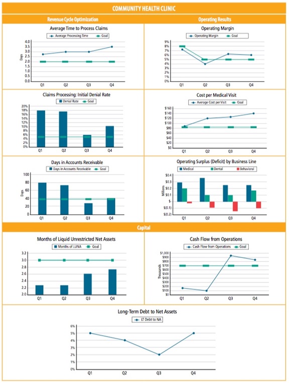
If we presented this dashboard to the clinic’s program and operational leadership, we could talk about what they need to do differently. Obviously, they’re doing something right when it comes to reducing claim denials—so we would talk about what they changed and why it worked. Then again, claim processing time is inching up. There should be a discussion about what is driving that increase and what can be done to bring it closer to the goal.This is the beauty of KPIs and dashboard reporting: now leadership is talking in teams about data and discussing how they can use that data to inform the next steps in a cycle of continuous improvement.
Homeownership Organization: Key Driver – Reduced Funding Dependence
The next example focuses on a community development organization that runs a program to increase homeownership within its community. With this dashboard, the organization is addressing the question of self-sufficiency for each of the business lines related to its homeownership program. The reason for this particular focus is that the organization’s leadership is aware that government funding—which currently supports these activities—will be slowly phasing out over the next few years. Therefore, if these programs are to survive, they must attain a certain level of revenue self-sufficiency. To understand how close they are to this goal, leadership needs the dashboard to help them answer the following questions: How much earned revenue is each business line generating? How much is it costing to serve each customer? Is the earned revenue sufficient to cover the costs? This organization needs a dashboard that focuses on a single priority: understanding profitability by business line.
With any organization where the business model relies on the ability to earn enough dollars to cover the cost associated with running programs, you will see a focus on costs and how to keep those costs as low as possible while still delivering a quality service. In this example, the dashboard is tracking the cost associated with serving each customer, over time, broken down by business line (see the homeownership nonprofit chart, below; note that we are only breaking out two of the business lines in the top two charts—the bottom two include all four lines). On the bottom-right side of the dashboard, there is a new element that hasn’t been included in any of the previous dashboard examples: a table showing three-year trends in cost, by the subcategories that make up each business line. Sometimes the devil is in the details, and graphing out this much data on one chart would have been either overwhelming or illegible. So, if a board member or a program manager wants to drill down and see more detail, a chart like this might provide a deeper perspective on why a business line is doing better or worse, what the trend has been over time, and how its individual components are changing.
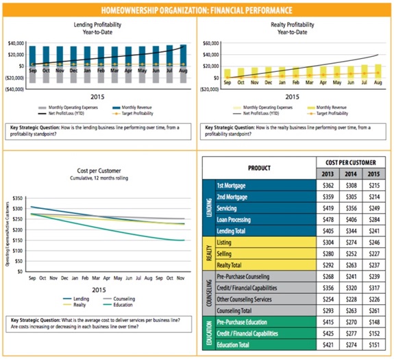
To further enhance the table in the bottom-right corner, the organization could consider adding the goals by category for 2016, so that leadership can start to shape what they will do to achieve those goals.
Looking at the lending profitability table (top left of chart), you can see how this organization is tracking profitability for their lending business line. Monthly expenses for the program show up in gray in negative numbers, while the earned revenue that comes in each month is charted in positive territory in blue. The target profitability for this business line is just above break-even, as represented by the orange line, and marks the point at which this program is self-sustaining. Actual profit (or loss) is charted cumulatively, compounding on a monthly basis over time. The data shows this business line to be on track, but as program leaders or board members look at this data, they should consider the following questions: What defines success for this business line? What might the organization do to adjust profitability and effectiveness?
Performing Arts Organization: Key Driver – Retention
Performing arts organizations have some similarities to our first example; in fact, they are like child-care centers in a number of ways. There is a finite number of seats or slots and the organization wants to make sure it is maximizing the revenue potential of this seating, which turns into dollars for the organization.
In the performing arts example we present here (below), in addition to the performance side (which is a dance company) there is also a school, and the school is intertwined with the dance company. Just as the performance side needs the same customers to come back as audience members for each new production, so does the school want to retain their students at the academy. So, on both sides there are some questions about retention.
You’ll see that this dashboard is constructed differently from the other ones we’ve presented here. For one thing, this dashboard is less about history and trends and more about tracking progress toward goals. But, more to the point, in order to highlight the impact of a more simply constructed dashboard tool, we’ve included this as an example of a format that does not rely on charts, graphs, and pictorial representations of data, but rather is just a simple table that can be created and updated in the most basic of word-processing platforms or spreadsheets. This is the easiest type of dashboard to create and maintain over time, though it does take a bit of work to ensure the information is as meaningful as what we see in dashboards with a more complex presentation.
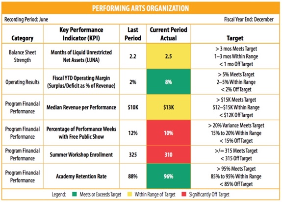
As in the dashboard for the health clinic, here we are also looking at months of LUNA—but in this case for a different reason. Performing arts organizations are often faced with the reality of production costs that are front-loaded: performers, directors, set designers, and the like must be paid during the preproduction phase, before any ticket-sales revenue is realized. For this reason, it is critical that a dance company have sufficient liquid resources to float these costs well before the box office receipts come in. Here, you can see that the organization has set a goal of three months of LUNA in reserve, but it is falling somewhat short of that target as of this reporting period.
Note that in this example, we are using stoplight color coding. How you define your targets (i.e., what will show up as red versus yellow versus green) is where performance management really becomes a philosophy for the organization. The question is: How will you determine that you’re way off course or that you’re within range but not there yet? Defining those categories is easier in some cases than in others. In the case of summer workshop enrollment, the organization needs to have at least 315 students enrolled or it is off target (as is the case here). But retention rates for the academy are more nuanced: over 95 percent retention is the ultimate goal, but between 85 percent and 95 percent is still within range (i.e., yellow). So, defining what’s close enough to avoid going on a red alert is where you engage your board and your management staff. It’s wonderful when you ask the staff for input on what success looks like to them, to what they want to be held accountable, and what celebration will look like. This is a discussion that builds accountability through engagement. Whether a result is defined as red, yellow, or green is a very simple idea, but coming up with those targets is where a common understanding of success can really be forged.
If the organization’s board were looking at this report, it would be immediately clear that the focus should be on enrollment in summer workshops and the number of free shows offered to the public. All of the other metrics are either on target or within the range of the desired goal. This is the benefit of setting and displaying clear, color-coded targets on a dashboard tool: they filter out the noise and focus your decision makers on the areas where action is needed.
Creating and Implementing Dashboards
How to Jump-Start the Dashboard Process
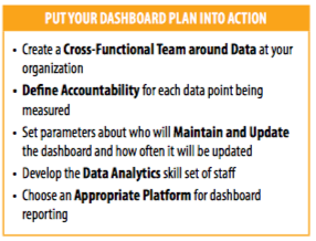
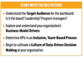
When creating a dashboard, start with the big picture: Identify the audience and understand how to engage it. Have the conversation to define business model drivers and key levers inherent in your program service-delivery model. Choose KPIs in a thoughtful, team-based process that is inclusive of the right staff and board members. Recognize that defining and reevaluating KPIs is an ongoing process: as your organization’s strategies, goals, and operating environment change, your KPIs will need to shift as well. If it doesn’t yet exist—which is the case for many organizations—begin to cultivate a culture of data-driven decision making among the staff and board. Ask whether your team is comfortable with interpreting and using data, and if not, what help they might need to get there.
When it comes time to put the dashboard-reporting framework into action, a new round of (potentially overwhelming) questions will emerge: Where is the data for the dashboard going to come from? Who will be accountable for collecting the data? How will the dashboard be updated, and how often? What platform should we use to create the dashboard? If building, populating, and maintaining a dashboard is a team effort, how do I ensure the team has the necessary skills to navigate different databases and spreadsheets and visualize data in the most effective way?
But in the end, in some cases, a simple one-page, table-based dashboard—such as the performing arts example—is all you need to jump-start the process of dashboard reporting. Rather than getting bogged down in questions of presentation, analytics, and software platforms, focus on the most important part of the process: defining those key drivers and metrics, and putting something in front of your board and staff that—with simple stoplight coding—will immediately shift attention to the most pressing issue at hand.