October 31, 2018; Saint Cloud Times (St. Cloud, MN)
Big Brothers Big Sisters of America is speaking a little bit louder now. But why does the venerable nonprofit need to shout to be heard?
According to a recent article in the Saint Cloud Times by Stephanie Dickrell, the BBBS rebranding effort—including a new logo —was sparked by a sense of urgency for children seeking mentors in communities like Saint Cloud, Minnesota.
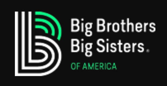
The well-known nonprofit recently launched a major rebranding effort across the country. Gone are the soft purple and abstract stick figures.
In their place, a black neon-green capital B, with three interconnected lines: the parent, the Little and Big joining together to defend the Little’s potential.
[…]
Leaders are hoping the change in language and presentation will catch the eyes of more and different people.
Big Brothers Big Sisters, whose national office reported $23 million in revenue on its Form 990 in 2016, describes the changes as a “new look” that better aligns with the nonprofit’s mission by sharpening its focus, “reimagining how we do things” and modernizing “how we look and talk.”
“The organization is intentionally pivoting from messages of the importance of mentoring, to messages of the urgent need for every child to have their potential defended and ignited,” a BBBS press release said. “The mission will remain the same, as will the core model of building bridges in communities by connecting one adult with one child and supporting that match at every stage, but the organization will focus on a child’s potential, and our role as adults in helping children achieve their best possible futures.”
Sign up for our free newsletters
Subscribe to NPQ's newsletters to have our top stories delivered directly to your inbox.
By signing up, you agree to our privacy policy and terms of use, and to receive messages from NPQ and our partners.
And for BBBS of Central Minnesota’s advancement director, Brenda Jacobson, that means her organization’s call to action now has a different focus, according to Dickrell:
“So before, we might say, ‘Please help a child,’” Jacobson said.
Now, they say: “Stand with us. Help us defend the potential that’s already within every child.”
When NPQ has covered rebranding in the past, we’ve cautioned against putting unnecessary marketing ahead of essential operations such as staff training and supported the idea of ensuring the process is inclusive and story-driven.
BBBS reports that the new logo was designed with input from “the Big Brothers Big Sisters affiliate network, key stakeholders, and Littles.” There are nearly 300 affiliates, with chapters in every state across the country.
Jacobson also sheds light on the laudable goal of the national and local offices to move away from a mentor-centric message—critical at a time when the United States and other countries are examining the roots and reach of the age-old “white savior complex.”
“We’re not rescuing a child,” executive director Jackie Johnson told Dickrell. “We’re not saviors,” Jacobson added.
Unfortunately, one change to the logo followed stereotypical gender rules: the move from purple to green and black in an effort to recruit more men. Neither does the BBBS press release mention diversity at the highest level, the Board of Directors, or in its national office.
BBBS has been criticized in the past for a lack of diversity, as NPQ reported in January. A former staff member called the organization out for imbalances of power related to people of color at an affiliate BBBS in Austin.
To be fair, a lack of diversity on nonprofit boards continues to plague organizations across the country. Still, we’ll be watching to see how BBBS’ new brand plays out internally and externally in the months ahead.—Anna Berry