October 16, 2018, Paste; October 9, 2018, City Lab; October 2, 2018, Inc.
While our sector may not focus much on branding, the government and private sectors are both very much experimenting with it. At a recent event in Washington, DC, brand designers met to talk about a growing trend—political branding.
City Lab’s Sarah Holder quotes Ben Ostrower, CEO and Creative Director of Wide Eye: “The biggest demographic in the country is not white men. It’s people who don’t vote.” She adds, “Design can play a big role in increasing turnout, simply by reminding people why voting matters, and how to get involved.”
Holder reminds us that in the 2016 presidential election, “a little more than a third of eligible voters across the country voted,” especially among people of color and Millennials.
According to Holder, the most “politically potent image of 2016” was Trump’s MAGA hat, which she says “initiate[d] strangers across state lines into a club governed by a shared (albeit amorphous) dream.” She notes, “As the country prepares for a midterm election, Republican and Democratic candidates running for positions up and down the ballot are trying to find their own Red Hat—a symbol and a style that sets them apart and sells their message.”
The designers Holder interviews have noticed a shift in the palette of colors, which until now, like politics itself, was limited. Red, white, and blue is being replaced with colors that reflect the rainbow flag. Similarly, stars and stripes are generally absent.
Holder writes, “For new candidates, especially, to run and win, logos need personality, authenticity, and punch.” She credits our newfound symbolic sophistication to our obsession with screens and visual content.
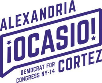
And luckily, we are evolving. Holder notes, “If the iconic image of 2016 was a hat, 2018’s answer so far has been an exclamation point.” She is referring, of course, to Alexandria Ocasio-Cortez’s ad campaign. She writes,
Designed by the New York-based firm Tandem, Ocasio-Cortez’ design uses splashes of bright yellow and deep blue, and a slanted font that leaps across posters and almost off the walls. Dual exclamation points with starts for dots frame “Ocasio”; words are contained in speech bubbles, as if made to be shouted.
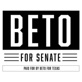
Beto O’Rourke’s “design team sucked out all the color from his stark black-and-white BETO FOR SENATE posters.” Stacey Abrams’ team chose “a dark, distinguished navy-blue background color with the candidate’s name in chunky, all-caps font. Splashes of brighter colors (an orange called Bittersweet, a green called Puerto Rico, and a light Cornflower blue) form an inclusive palette.” There are many others.
Behind this new branding are new branders. Holder writes, “To market new candidates, you need new blood in the design room.” Anjelica Triola, co-founder of Creative Caucus, says the design team must include “political outsiders.”
But, Holder warns, “there’s a fine line between paying too little attention to design, and too much.” She reminds us that Hilary Clinton suffered from too much design. Her “polished, well-oiled campaign literature was cohesive, and on-message, and fastidiously crafted,” but “its professionalism may have also fueled the perception that Clinton was an aloof, overly-managed candidate.”
On the other hand, Shane Ryan of Paste calls Elizabeth Warren’s attempt to prove Native ancestry through her recent public announcement of her DNA test in response to a challenge by President Trump “the worst political gambit of the 2020 presidential election cycle”—so far, at least. He notes that, in doing so, she didn’t just make a big mistake in “engaging with the party of bad faith,” letting them frame the narrative. (In this case, it’s one the Republicans launched in 2012, when she ran for the Massachusetts Senate and they revealed that she claimed Native ancestry while working at Harvard. Trump extended it when he began referring to her as “Pocahontas.”) She also alienated many in the Cherokee nation by claiming to be Cherokee—something that is not, apparently, determined through DNA testing. (To be fair, she is relying on personal family history.)
Sign up for our free newsletters
Subscribe to NPQ's newsletters to have our top stories delivered directly to your inbox.
By signing up, you agree to our privacy policy and terms of use, and to receive messages from NPQ and our partners.
Ryan points out that Warren “should have checked in with the Cherokee Nation beforehand to see how the move would be received.” He continues, “That seems like pretty standard political operating procedure, right? Making sure your allies are actually, well, your allies?”
Ryan goes deeper: “Implying minority [sic] ‘heritage’ on the basis of some DNA test, when you’ve lived an entire life as a white person and all the privilege it entails, is a terrible look.”
Ryan sees Warren’s video explaining her side of the story as “pathetic” and “the worst kind of political pandering…pandering to a group of people who are not even her base.” He sees this as an outmoded strategy of wooing the middle.
For him, there was only one response: “You ignore it. It’s not satisfying, and it may feel like conceding, but anything more than a scoff and a condescending smile for these ghouls is too much.” Ryan concludes that Warren’s politically unsophisticated move discredits her as a presidential candidate, something many believe she is aiming for in 2020. (Ouch.) The fact that the article appears in an entertainment magazine speaks volumes.
But that’s how critical these symbols are. They tell the world who you are. And in these times, who you are is political.
Even Nike knows this. Inc.’s Geoffrey James writes, “Nike’s embrace of Colin Kaepernick has been wildly successful for the company, even though it runs afoul of standard branding practice,” which generally “shie[s] away from political affiliation.”
James argues that there are three reasons brands “may be forced to ‘take sides’” now.
- First, brands target emotions and, at this point in history, the strongest emotions are around politics and social change.
- Second, thanks to the Internet, corporate donations are more transparent, subject to scrutiny, and incite strong feelings.
- Third, the cost of being on “the wrong side” is higher. It includes boycotts and reputation harm.
Unlike Warren, Nike knows who its constituency is and who it is not any more. James writes,
By associating its brand with Kaepernick and the Black Lives Matter movement, Nike increased its brand’s attractiveness to a rapidly-growing, young, urban, hip, ethnically diverse demographic—the very people most likely to buy expensive athletic footgear.
At the same time, Nike also intentionally cut loose a declining, older, rural, squarer, and whiter demographic that was never a big part of their target customer base anyway. A different brand might find the opposite smarter (think Hobby Lobby).
James notes that what Nike did makes sense for who it is.
Nike, of course, has always been an innovator in brand development, so it’s not surprising that it would figure out that it would be in its best interests to drive the process of “taking sides” rather than simply react to our society’s increased divisiveness.
But what about nonprofits? Here at NPQ, as our coverage of these issues increases, we receive letters from our readers that tell us we are getting political. They may not be aware that politics actually drives our work. As we say on our website, “NPQ’s guiding philosophy is that an active, engaged, and sometimes disruptive civil sector is critical to a healthy democracy in the same way that a free and independent press is…Nonprofits make thriving communities, a responsive government, and a vibrant democracy possible, and NPQ’s mission is to provide quality information to help them perform at a better level.”
So now that you know, does your nonprofit know who its constituency is and how to talk to it? Political theorist Chantal Mouffe reminds us that the concept of neutral ground hides conflict and is always a hegemonic construction.—Cyndi Suarez


