GuideStar went live yesterday with its new nonprofit profiles, and if you have not seen the quite phenomenal change in look and accessibility at this central hub of nonprofit information, you really should go check it out.
This is the first significant reboot of the site since 2009. As most of you will know, every nonprofit that files a Form 990 has the information in those documents stored on GuideStar, where they can be retrieved by funders, potential funders, reporters, and other interested parties. Up until now, the format under which that information could be accessed was relatively static and not exactly user-friendly. The 990 information was stored year by year, and the whole presentation was accompanied by a colorful ratio graph that reinforced the importance of overhead—although GuideStar disavowed overhead as a central measure more than a year ago. That pie chart is gone now.
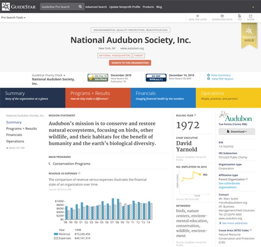
The new summary page on any particular profile looks like this:

As you can see, GuideStar made the decision to include space for a good deal of information that’s not contained on the 990s. (This information needs to be entered by the nonprofit organization itself; more about the implications of this decision later). From the top bar, you can dig further to find out more about, say, the organization’s board, its diversity profile, or the salaries of its top earning employees. You can even connect to the organization’s social media presence. This makes the site a very attractive first stop in looking at an organization, at least in theory.
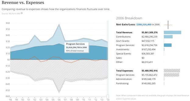
Perhaps the most exciting design feature for hardworking reporters and funders is the ability to see at a glance the financial travails of an organization over as many as 15 years. This provides users with a visual story that can be interesting not just on the level of an individual organization but also in terms of mapping a history relative to what was going on around the organization at the time.
For instance, the graphic below is a mapping of revenue and expenses for the American Red Cross. You will note two spikes in revenue and expenses. The first was in response to the September 11th attacks, and the second in response to Hurricane Katrina. But, says Jacob Harold, the CEO of GuideStar, you may also note that the spike in expenditures is more restrained than that of donations. This was, as you may remember, a problem for the organization, which was challenged by donors for its waylaying of donations made in response to 9/11 appeals to other purposes. Harold points out that the organization did not repeat the mistake in the wake of Katrina even though they may have been better paying out to local organizations on the ground over a longer period of recovery. The red dotted line shows the net revenue year by year. On the site, there is a moveable vertical bar that allows you to examine the finances year by year along the timeline.
This particular feature is available only to those with Premium subscriptions; the huge majority of the site’s users does so for free, and thus does not qualify. But, if you input all of your own organizational information and achieve “Gold” status, you will be awarded such a subscription for free!

You may also note that the source of information and date of its entry are included below the data on the displays.
Sign up for our free newsletters
Subscribe to NPQ's newsletters to have our top stories delivered directly to your inbox.
By signing up, you agree to our privacy policy and terms of use, and to receive messages from NPQ and our partners.
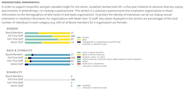
As we have mentioned, one of the other attractive features of the redesigned GuideStar site is a reflection of diversity data—although it, too, is dependent on voluntary inputs from nonprofits. Below you will see the diversity profile of the Audubon Society.

Over the next few years, GuideStar intends a few more rounds of improvements—automated compilations of a field’s information, for instance, which will be invaluable for habitual benchmarkers and researchers.
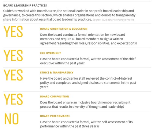
Now, a word of concern about the new site as it evolves: Some of the new categories of information trouble us, in that they are presented side-by-side with the information on the 990. Specifically, we worry about highlighting questions of largely unknown importance, as in the governance section, where one is asked, for instance, if they have engaged in a board assessment over the past year.

The presence of these questions, as with the old ratio-based pie chart, gives them an authority that I think is less than useful. Additionally, I think GuideStar’s decision to prioritize program information is fine, but this area may be prone to marketing puffery and that may lessen the credibility of the 990 data without some more obvious caveats.
A New Guidestar
In summation, this isn’t your dad’s passive and somewhat clunky GuideStar anymore. To make full use of it for yourself and to make it work optimally for others, nonprofits actually have to participate by inputting their own information and by helping GuideStar, through feedback, fine-tune the way that information will be gathered and portrayed.
Harold says that this upgrade took a solid year of collaborating with organizations like BoardSource, BBB Wise Giving Alliance, D5, and Independent Sector to develop the questions, as well as design, coding, and architecture. They had to ensure that the many differences and exceptions in the 990s were taken into account and that all the little puzzle pieces fit together.
We think the result shows the effort. It is a remarkable step forward for a sector that has had to fight every inch of the way for access to its own data.


