
Editors’ Note: This article is from NPQ‘s new, spring 2015 edition, “Inequality’s Tipping Point and the Pivotal Role of Nonprofits.”
Over the course of sixty years, the United States has moved human services from public to private provision. The poor, who used to go to county health departments for their medical care, now go to nonprofit health clinics or even for-profit hospital emergency rooms. Mental healthcare famously moved from state hospitals to nonprofit outpatient services. Vocational training is now offered by nonprofit contractors. Even legal services in many jurisdictions are handled by nonprofit legal clinics or private attorneys funded by counties as piecemeal public defenders. As Steven Rathgeb Smith and Michael Lipsky have articulated, the public-private “contract regime” is here to stay.1
Privatizing human services has had many positive aspects. First, it has allowed for greater flexibility. Clients potentially have choices. Nobel laureate Elinor Ostrom and her husband, Vincent, held that this would create a polycentric system, where choice leads to what they called “public economies”;2 public economies allow for competition, which in turn can lead to better services for all. Second, privatization can result in services that are tailored for particular communities. No longer is it a one-size-fits-all government bureaucracy but rather a series of small, community-based providers that are close to their clients. Lastly, privatization moves liabilities off the books of governments and onto those of private organizations. The perceived headaches of government—payment of employees, negotiations with unions, depreciation of equipment and buildings—could instead become the headaches of contractors. And, in some ways, this has resulted in a malleable and efficient system for many Americans. But there is an aspect of the privatization of human services that has not been adequately studied—that of geographic space.
Mapping Human Services
Geography is traditionally a central concern for government-provided services. A concern of elected leaders, whether congressmen or city councilors, is that their district receive a share of services—and there have always been due-process concerns with regard to schools and public defenders. Now that human services have in some cases moved to private providers, it becomes even more crucial to understand space.
A core argument for privatizing human services is that it brings services closer to the people who need them, yet this argument is difficult to study. A cartography of the nonprofit sector could help, with mapmakers not only looking at geographic space but also at the relationship between people and the services they demand. There would need to be two different types of maps: one that charts the populations needing services, and another that charts the providers supplying those services.
Maps of human-service demand are tricky. In a forthcoming study, conducted for the Kresge Foundation, in which I attempted to map the interaction of where human services are delivered and where they are needed, I asked leaders of nonprofit, public, and for-profit agencies to mark on a map the locations of clients using their programs. Some leaders were able to use program data to identify client locations, but the majority had to rely on gut intuition, and said such things as, “Yeah, I think that most of our folks come from neighborhood X,” or, “There’s probably a Hispanic population in that area that we aren’t reaching, but we just haven’t had time to try.” Asking a wide range of people if they need a service is an expensive process, but the private sector often does this (in Nielsen surveys of consumer preferences, for example). The data that governments typically use, if they use them at all, are proxies: levels of unemployment as proxies for the need for vocational training; birth rates as proxies for future Early Head Start sites; etc. Proxy measures aren’t perfect. They are almost always aggregate measures per census tract or political boundary, which may not help in locating populations within that region. Proxies almost never completely capture the variable of interest but rather correlate with it to a certain degree. Each of these factors affects the validity and reliability of demand maps.
Supply maps are equally difficult to generate. The contract regime has opened up a mind-boggling array of potential human-service providers, and maps including only nonprofits are far from sufficient. Maps must now include for-profit providers. As an example, the hospice industry was, traditionally, dominated by nonprofits until the 1986 Medicare Hospice Benefit was made permanent; now for-profit franchises have come to be the largest segment in end-of-life care. Maps must also now take into consideration nonprofit charities—which in the past were excluded—via data drawn from 990 IRS returns or secretary of state listings.
Geography Matters
The new world of publicly funded, privately provided human services opens a new discussion about inequality on two fronts: inequality of spatial access to services, and inequality of quality of services. Whereas when services were publicly provided there were institutional avenues for registering dissatisfaction with access, the introduction of private providers adds a level of distance between potential clients and their governments.
Geography matters in human services. Human services are almost entirely provided in situ (day care, for instance, cannot be outsourced to a foreign country). The importance of location is amplified for poor individuals who have limited transportation. For instance, Scott W. Allard, analyzing the spatial allocation of vocational training services in Los Angeles, Chicago, and Washington, DC, found that in our post-welfare-reform world, those who need vocational training tend to live far from where vocational training services are offered.3 Amy E. Hillier moves beyond looking at literal distance to consider imagined distance; in a study of Camden, New Jersey, she found that African Americans will not access services in what they perceive to be a Hispanic neighborhood, even if it is much closer than the next option.4 Inattention to matters of geography results in misallocation of services.
An added complication is that not all service providers are equally financially healthy. The recent recession has highlighted the fact that, whereas governments very rarely go bankrupt, private providers can (and do) close their doors, potentially leaving a community without access to a necessary service. In my research I consider two aspects of human-service geography: the financial health of nonprofit human-service providers, and the demographics of the communities that they serve.5 Or, as I describe it to my students, I am a nonprofit pathologist: I study “sick” nonprofits and who will be affected by their death should they perish.
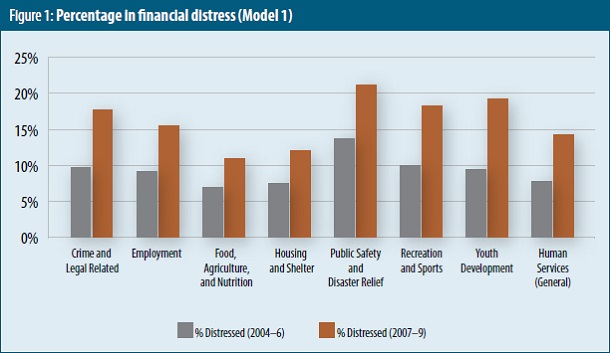
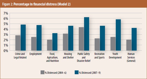
My research covers human-service nonprofits in two periods: a pre-recession (2004–6) and recession (2007–9) timeframe, with a focus on organizations that are financially “sick” and potentially threatened with closure in the near future. Human-service nonprofits provide resource-intensive services, so a large drop in spending is a signal that the organizations are no longer serving clients at the same level. I created two levels of “sick”: organizations that had a 25 percent drop in expenditures (Model 1) and those with a 50 percent drop (Model 2) over the time period (see figures 1 and 2). The results show a marked jump in levels of financial distress from the pre-recession to recession periods for both models.
Sign up for our free newsletters
Subscribe to NPQ's newsletters to have our top stories delivered directly to your inbox.
By signing up, you agree to our privacy policy and terms of use, and to receive messages from NPQ and our partners.
On average, just over 9 percent of all human-service nonprofits were financially distressed (Model 1) before the recession, whereas close to 16 percent were distressed during the recession. A similar pattern is apparent for the severely distressed organizations (Model 2).
The results require more precision: What types of organizations potentially face closing their doors? The answer is small nonprofits. Almost 20 percent of organizations with annual revenues less than $500,000 were distressed (Model 1) in the recession period. This compares to only 7.2 percent of organizations with revenue above $5,000,000 during the same period.
The important question then becomes, who is served by these ailing organizations?
The first step was to map the location of the organizations based on the addresses included in their 990 forms, excluding those with PO boxes. This is fraught with error, because the mailing address of an organization is not always the location of its service delivery. Unfortunately, with a national study, it is impossible to check locations of each and every nonprofit. The compromise was to count the number of distressed organizations via census tracts in order to see what communities had the greatest number of ailing human-service nonprofits. It was possible to correlate the number of distressed organizations (a rough supply-side map) with the demographics of that community (a rough demand-side map).
The results represent correlations, which range from –1 through +1. A positive number represents a positive relationship between the variables, and, likewise, a negative number indicates a negative relationship. The asterisks are an indication of how confident we can be in the result, with three (***) being the highest level of confidence (see figure 3).
As figure 3 demonstrates, there is a positive correlation between the number of minority individuals in a community and the number of financially distressed human-service nonprofits. This correlation only intensified during the recession period. I found a similar trend using a measure of diversity in a particular census tract—essentially, the chance that any one person will interact with someone of a different race or ethnicity. Lastly, there is a strong relationship between being a frontline organization and being financially distressed, particularly during the recession.
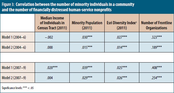
The frontiers of understanding inequality across geography are rapidly expanding. My current research, conducted with Drew Westberg, a graduate student in economics at the University of Missouri-Kansas City, uses predictive models and simulations to identify the types of communities that are most likely to face distressed nonprofit organizations. All of our models indicate that African-American communities, even controlling for income and unemployment in those communities, have the highest number of distressed nonprofit human-service providers.
This line of research has direct implications for public policy. One of the foundational concepts behind the provision of public services—that individuals shall be afforded access to public services—is that of due process, enshrined in the Fifth and Fourteenth Amendments to the U.S. Constitution. Does this extend to services provided by government contractors? Is there an implication about the quality of service? While I am no constitutional scholar, I believe these questions warrant discussion between the American public and its elected leaders.
• • •
Maps give us a means of understanding where financially distressed nonprofits are located, but they should not be used solely to identify “bad actors” that can’t be trusted with a contract or grant; maps can also be used as tools to identify organizations that are key bridges to communities in need, in order to better direct funding to strengthen these bridges for the future.
Ultimately, mapping service providers can enrich the debate over privatization. I cannot speak to the quality of services nor the financial strength of the contracting organizations—this area of research is in its infancy, and requires the sustained support of practitioner, academic, and funder communities. But this model of delivering human services will not fundamentally change over the next several years, and policy-makers, practitioners, and scholars should grapple with the implications of space being a key dimension in the equitable delivery of human services.
Notes
- Steven Rathgeb Smith and Michael Lipsky, Nonprofits for Hire: The Welfare State in the Age of Contracting (Cambridge, MA: Harvard University Press, 1995).
- Vincent Ostrom, “Polycentricity 1,” in Polycentricity and Local Public Economies: Readings from the Workshop in Political Theory and Policy Analysis, Michael D. McGinnis, ed. (Ann Arbor, MI: University of Michigan Press, 1999).
- Scott W. Allard, Out of Reach: Place, Poverty, and the New American Welfare State (New Haven, CT) Yale University Press, 2009).
- Amy E. Hillier, “Why Social Work Needs Mapping,” Journal of Social Work Education 43, no. 2 (July 2007): 205–21.
- Brent Never, “Divergent Patterns of Nonprofit Financial Distress,” Nonprofit Policy Forum 5, no. 1 (October 2013): 67–34.
- The Esri Diversity Index measures on a scale from 0 to 100 the likelihood that two persons, selected at random from the same area, would belong to a different race or ethnic group.