July 6, 2013; The Economist
A recent review at The Economist covers three recent books on data visualization. We thought it was worth passing along to you because there is nothing more elegant than a simple presentation of a complex issue. The review focuses on a quandary: With so much data around, how can we make it easy for people to absorb it? This has brought forth a corps of statistician/designers who are seeking out new techniques for depicting data “at scales and in forms previously unimaginable.” This review says that the “simple line graph and pie chart are being supplemented by things like colourful, animated bubble charts, which can present more variables. Three-dimensional network diagrams show ratios and relationships that were impossible to depict before.”
Sign up for our free newsletters
Subscribe to NPQ's newsletters to have our top stories delivered directly to your inbox.
By signing up, you agree to our privacy policy and terms of use, and to receive messages from NPQ and our partners.
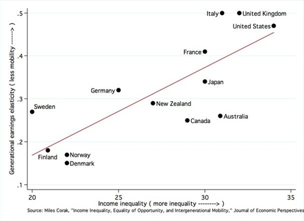
NPQ thinks the books sound fascinating, and we’re blown away by the “wind map” but we entreat readers not to assume that a simple line graph and chart…

…or a silly animated video…
have passed their “sell-by” dates. Simple, timeless elegance.—Ruth McCambridge


