
Editors’ note: This article, first published in print during July/Aug 2017 has been republished for Nonprofit Quarterly with minor updates.
In March, I saw Jose Antonio Vargas’ keynote at a conference at the Pacific School of Religion in Berkeley on the role of faith communities in immigrant rights. Jose spoke courageously about living openly as an undocumented immigrant since 2011. As an openly gay Filipino American, this second act of coming output Jose in the midst of a national firestorm around immigration reform. The political right portray undocumented immigrants as social threats, criminals, and unknowable “Others.” In contrast, as an award-winning journalist, Jose was a widely-respected familiar face and trusted voice. While Jose’s coming out marked the end of his career in reporting, he used the tools of his trade to tell powerful stories about undocumented immigrants and other marginalized people. In 2011, Jose founded the nonprofit Define Ameri- can, which puts the voices of immigrants into popular media and advances myth-busting facts to counter fake news. Together, the stories of immigrants bolstered by data have the power to change hearts and minds around immigration.
Following my first article, “Telling Your Story With Data” in the November–December 2015 issue, this article will look at what Define American has done to communicate complex messages using data through their #FactsMatter campaign. We’ll glean lessons that will be relevant to your group; in particular how to broaden a nonprofit’s scope from engaging, educating, and advocating for communities you serve to translate often highly nuanced impact into terms that anyone can understand.
Here are a few guiding questions for leveraging data visualization for social good:
Does It Have to Be a Chart?
OK, let’s say you have data you want to show. You’re so excited about it and you want everyone to be as excited as you are. You think charting it is the way to go, which is great. But wait, does it have to be a chart? Let’s pause to ask a few questions that will help ensure you’ll actually reach your audience with the story you want to tell.
Who is your primary audience? Do you know their information habits?
Are they a new or existing audience? Do you know their information consumption habits? (If not, you may want to do more research.)
- What are the ways they get information today? Do they include data-friendly forms?
- Do they prefer to consume tweets shorter than 140 characters, eye-catching visual Instagram posts, friends’ testimonials on Facebook, or more rigorous long-form journal articles?
- Can your story translate to one of those forms? Does your story come to life by showing it through data?
- Is the content well-suited to the form? (Some aren’t and shouldn’t be forced to fit.)
- Do you have the will and capability to take on that form?
- Last, what will it take for your audience to believe the data? Will data actually change how they think?
- If you’re engaging an audience that feels the way you do, you can tackle more complex issues. If they’re already primed, they may do a bit more work to increase their knowledge.
- If you’re speaking to folks opposed to or critical of your point of view, you may need to try a different approach. For example, your data could include an emotional appeal that builds empathy, align with a universal human interest, or go through an influencer your audience trusts in order to change attitudes and openness to new information.
So, if you know your audience, if they consume data in their media diet, if your story can come to life through data, and if data will change how they think, great. If not, consider other options.
What does Define American do? They lead with human stories. They build empathy and connection between their audience and the lives of undocumented immigrants through relatable, personal and emotional videos, articles, and social media posts. Why? Many Americans may not know or identify with undocumented immigrants, or how much worse their lives will become with increased enforcement, detention and deportation, much less a border wall. Then after building this connection, Define American presents us with facts and numbers, offering a powerful one-two punch.
Questions to Consider:
- What story do you want your audience to take away from the piece?
- Is showing data the best way to reach your audience with that story?
Is Your Story Instantly Clear?
When I worked at the Wall Street Journal, we created information graphics to visualize data for the most important stories of the day. Understanding that our audience would be browsing many stories across many pages, we asked ourselves: Can the reader get the gist of an infographic in just a few seconds? If it takes longer and the piece is more complex, the reader is asked to do more work and they may instead move on. We always tried to find the balance between punchy simplicity and nuanced rigor.
Sign up for our free newsletters
Subscribe to NPQ's newsletters to have our top stories delivered directly to your inbox.
By signing up, you agree to our privacy policy and terms of use, and to receive messages from NPQ and our partners.

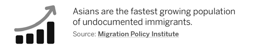
The lesson here? Show just enough data—not too much—to communicate your message. Sometimes a visual representation of a trend or pattern is effective and you don’t even need data points. (Just be sure to have the data to back up your argument, and cite your data source.) For example, when Define American asserts, “Asians are the fastest-growing population of undocumented immigrants” it displays a compact graphic of four bars with an arrow trending up. This is not an actual chart—it’s an icon, and it gets the job done.
By contrast, the same headline could have been supported by a multi-line chart showing the immigration rates of multiple groups as absolute numbers or as annual percentage changes. This would present much more information and ask the reader to process more data. Some audiences may desire or even demand this type of detail and rigor (e.g., if you’re talking to immigration experts or policy wonks). But for many audiences, complexity is not needed or appropriate—you can lead with a simple approach first and take it from there.
Key Questions:
- If you see the graphic for the first time, do you understand it in under five seconds?
- What can you strip away to distill the data story to its barest essentials?
How Powerful Is Your “Aha” Moment?
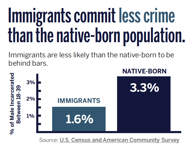
Two values: 1.6 percent and 3.3 percent. If you were to see these percentages by themselves, you may think: those are pretty small numbers. They seem small in relation to the whole 100 percent. And there’s not much difference between them—a percentage point or two. Now, show these values as weighty bars in a chart, and you see one is over twice as large as the other. Add a pithy headline, “Immigrants commit less crime than the native-born…” and these elements add up to an infographic that may tell you something new, shows it in a different way, and packs visual gravitas. In sum, it delivers an unexpected “aha” moment. Visually, the heavy lifting is done by the bars which show contrast that numbers alone do not do well. 1.6 vs. 100? 1.6 vs. 3.3? 1.6 is less than half 3.3? It will likely take a lot of experimentation and many iterations to get the visualization right. Finding the right visual benchmark for your data is an important step to show meaningful contrast and will help make your story more compelling.
Key Questions:
- What are you comparing against? Where is the contrast?
- What is the meaningful benchmark that puts it all in context?
How Do You Set Your Audience Up to Take the Next Step?
So, once your audience feels connected to the people you serve, understands your story clearly, has had a few thunderbolt “Aha” realizations, and is now even more excited than you… what do you want them to do next? Do you want them to share your story? Talk to an elected official or institution? Give your organization money? Volunteer their time and resources? Step up to be more active in the community?
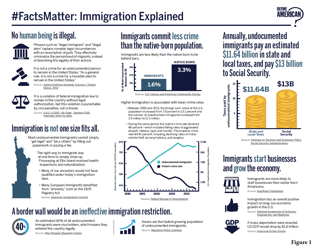
Define American offers a few ways to engage. The easiest is to share on social media and re-broadcast posts (right now they’re promoting their film festival in North Carolina about undocumented immigrants). A #FactsMatter fact sheet (see Figure 1 on the previous page) packages the top six myth-busting infographics in a format well-suited for printing and handing out at events. The website provides other statistics and data points that are easily tweetable.
In closing, data visualization can work well alongside other types of storytelling. Like the varied tools in a superhero’s utility belt, we can tell stories in myriad ways for myriad purposes. Data is one of those tools. When used in the right way, and in concert with compelling human stories, data can work to change minds and hearts and spur your supporters into action.