August 24, 2013; Nonprofit Tech for Good
Sign up for our free newsletters
Subscribe to NPQ's newsletters to have our top stories delivered directly to your inbox.
By signing up, you agree to our privacy policy and terms of use, and to receive messages from NPQ and our partners.
LinkedIn has implemented some new changes into their social network, which may affect how nonprofits use the website, and specifically how groups will function. The new design will focus on user engagement, encouraging individuals to participate in posts and discussion in order for content to get noticed. These changes also aim to reduce the amount of spam and promotional content that appears in groups, a problem which has increased in the past few years.
Nonprofit Tech for Good has highlighted five changes that may have an impact on how nonprofits use LinkedIn. Here is a list of the new changes to look out for:
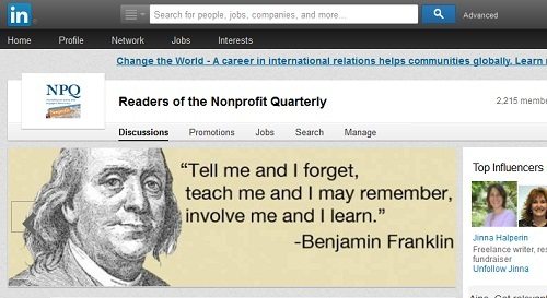
- Feature Manager’s Choice & Banner Image in Groups: The most significant design change LinkedIn has made is in creating a new sleek design for the Manager’s Choice posts, which used to be inconspicuously housed on the upper-right corner of groups. Now, when posts are selected as the “Manager’s Choice,” they will appear in a prominent box above and larger than all other discussion posts. Along with this new, featured box, group moderators can also now choose a banner image with an inspirational photo or quote that will depict or exemplify your group’s message and audience. The banner will appear as the default image up top before scrolling to the highlighted Manager’s Choice discussions. This banner feature could be very valuable for nonprofit organizations that want to emphasize images based on their mission or highlight an inspirational hero in their organization’s field.
- Spam Control: LinkedIn has now created two separate feeds in groups, which organize the discussion based on popularity and how recent the posts are. The discussion page automatically loads to the “popular” tab, which aims to let spam posts go by unnoticed and to bring the focus to posts that are encouraging engagement.
- Increased Mobile Access: LinkedIn has also redesigned its mobile compatibility, which features a simple format for mobile phones to browse discussions and add comments or likes to posts. The new mobile design moves away from using the app primarily for job searching and focuses on customization and content. Users can now personalize the app navigation bar to show areas they visit most on the site.
These changes will hopefully help maintenance within groups to be less time-consuming for moderators. These design tweaks are also part of LinkedIn’s strategy to revamp groups and user engagement, ensuring they are still valued as a space to engage in quality discussions.—Aine Creedon


